Web GIS metrics and patterns with Google Analytics

Scouring through some blogs the other day I came across an article from Esri regarding the “Most frequently used Web AppBuilder for ArcGIS widgets in publicly available apps”. Web GIS metrics aren’t discussed very often, so definitely worth a read. It’s actually a review of 10,000 public apps and most popular widgets in use. I would typically read the article, make a mental note or two, and move on – but this article led me to ask myself a few questions: How do the tools we add to the apps relate to web GIS metrics/analytics? What tools are used by end-users the most?
The Esri article breaks down the widgets by type (off-panel, in-panel) and also mentioning themes and default widgets that have an impact on the statistics. Beyond the defaults already built into a theme, widgets are added by AGOL administrators (or via JavaScript development) for a variety of reasons.
Now that we have functionality added, how can we track usage and patterns? In this case, Google Analytics to the rescue! After a quick disclaimer of course: This is based on one web application over a sample time period that tracks some, but not all functionality. So take the rest of this article and metrics with a grain of salt.
Web GIS Metrics – The application du jour
To review metrics, we needed access to an application that collects… metrics. Thankfully, the organization I work for has developed a custom (2 guys with Notepad++) web GIS application with lots of tracking. This application was built after reviewing many existing functions provided by widgets, our existing (older) web-GIS applications, many municipal web GIS applications, and discussed functionality/usability with staff (end users). The application is also available to the public but some functionality is removed to keep it a little more streamlined.
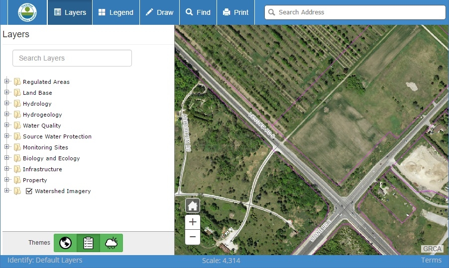 GRCA’s Web-GIS Interface
This is a “web-GIS”, not a “focused web map”. We have both types of applications at our organization, but the main web-GIS is easier to analyze a wider range of functionality. I should also point out that since staff use the application for specific purposes (public as well), metrics will be skewed to this use. Lastly, application design can impact user interactions as the layout will help (or hinder) the ability of the end-user to navigate functionality.
Web GIS Metrics – How we track stuff
We leverage Google Analytics (GA) to collect metrics. This also means we have 3 levels of event tracking available. For example, whenever an end-user interacts with the application, we store 3 pieces of data: draw a polygon while using the Planning theme. The “Planning Theme”, “Draw Tools” category, and “Draw Polygon” tool info is stored. This allows us to review not only the functionality used, but the type of use, and context (theme).
This isn’t to say we track every user interaction. Clicking on the map will automatically identify operational layers as set in the theme configuration. The general identify tracking is disabled since it happens so frequently the extra metrics (REST calls) annoyed some firewall appliance settings (for now). However the user can override the pre-set identify settings to focus on any one layer – this specific info is tracked in GA. Table of Contents (TOC) tracking is also limited to specialized events (Changing themes, viewing metadata, etc.) and doesn’t track the toggle of layers on/off.
Web GIS Metrics – Functionality
Statistics are sneaky. And like maps, they can be misused and/or misinterpreted, and not saying I’m going to get it all right here either. GA Events are updated each time users interact with related functionality. So if a user draws 3 lines, and only prints the map once – Draw technically has more usage, even if more 2 users print. With GA, we can look at events in many ways: Total events for all sessions, session where the event occurred at least once, events by category and type, etc. Let’s take a look at event totals and event occurrence within session for a small sample time period with 13,168 user sessions and 46,396 user events.
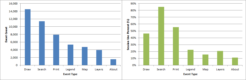 Google Analytics of Event types by Count and by Percent of Sessions for a small sample time period
Within this sample, Draw tools (draw lines, polys, callouts, text, points) have the highest number of total events (14,536) [left chart]. The Search tool (big search box) has the second highest number of events; however this metric alone can be misleading. 90% of all user sessions search at least once, while only half of user sessions (46%) actually draw something [right chart]. The users that do Draw, add lots of graphics/text in one session. The print tool has a similar pattern: it has half the number of total events compared to draw, but is used in more total sessions.
This makes sense: We search and find area of interest (hopefully on the first try), possibly sketch graphics on the map, print the map once and close. And if you did sketch something you took your time and added lots of details (graphics). Side note: time on the app is also tracked, >12 minutes on average if drawing.
The assumed workflow above is confirmed with Google Analytics Event Flow report. This allows us to review the most popular first event by session. For both public and staff, the most popular first event is Search (note: pan/zoom not tracked). The second event for Public users is typically to view the legend, while Internal Staff second event will vary more widely (since they see these layers every day and don’t require the legend as often).
Web GIS Metrics – A few extra details
This isn’t to say low metrics of a tool is bad. The “About” events provide information to those that need it (corporate info, training, disclaimers). Hopefully this info isn’t needed frequently, but it should still be available. So there might be some functionality you include without high usage intentions.
I should mention that the Esri article statistics and the ones described above can’t really be compared. The Esri article reviewed the number of apps with functionality added, not the usage within the app. And our web-GIS is just one implementation based on certain use cases. What I can say: Search and Print are the two of the most important tools in our web-GIS relatively speaking – not by total clicks, but used by the most people.
Even though the original questions have been answered, this is by no means close to describing what is possible with Google Analytics – more the tip of the iceberg.

If you found my writing entertaining or useful and want to say thanks, you can always buy me a coffee.