Map of the Day - The New York Times


A great web mapping example. The New York Times Crime map has been around for a while now (June 18, 2009), but it’s still worth discussing. I sometimes dive into my browser bookmarks just to find it when I need some inspiration. Why? It gets so many things right! The topic is a little sensitive (homicides in New York) but the way the information is communicated on a map is very well done.
With 10 ways of categorizing the data and the ability to filter the results by year, a visitor to this page can drill down into the details and interact with the map without requiring a GIS diploma. As well, the map fits into the existing page design, becoming an interactive newspaper article, not a GIS map. From a GIS point of view, the 10 categories are just layers that could be in a table of contents (TOC) - but the map isn’t made for GIS people. The TOC has been transformed into an interactive gallery that communicates information to the user: Number of homicides by year; Stats on previous year variation (using a variety of fonts/sizes to guide the user); Change the type of information being visualized. Even the Legend control doubles as a chart, showing statistical breakdowns and colour coding.
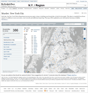
This map could be used as an image in a traditional newspaper that landed on your driveway. It would still communicate a subset of the information to the reader (albeit no additional interaction). A subset of the news article and the header/footer of The New York Times is still present, and a link to the full article is also included.
GIS on the Web
Some in the industry, including myself, are trying to change how we use GIS on the web: Create for the end user, and design to incorporate into your site based on the subject matter. Why are we still making “map portals”? People don’t make “Chart portals” to show off the entire organizations’ list of bar-charts and spline graphs. These are usually embedded into the subject matter pages directly (ROI graph on an investment page) – providing a way to communicate data/information that might add to the subject. Maps (apps) should be viewed in a similar way when there is a focus/purpose to map. The world of GIS, might not be completely ready for the transformation away from map portals, but something we should keep in the back of our minds when we have our next request for map website.
The Details
Rant complete, back to the Crime Map that has many subtle features as well: The grey-scale basemap as to not grab your attention, and the additional sentence to let you know how much data isn’t shown (example: “Map does not show 1 location that the police have not released”). The address and ZIP search box is still there for those want to find out if they are living in a hotspot , but it’s not the focus of the application or the news article. The time slider is also very useful and changes the views and statistics as you interact - long before this functionality was easy to implement with traditional tools.
The New York Times has produced many great maps like this one. They find ways to communicate the information based on users, the subject, and data. Well done NYT.
Update (May 07, 2014 @5:10pm est): For those interested in a New York Times map that doesn’t use flash, checkout the JavaScript Health Department Restaurant Ratings Map.

If you found my writing entertaining or useful and want to say thanks, you can always buy me a coffee.